Brand Building
Client: KC Photography
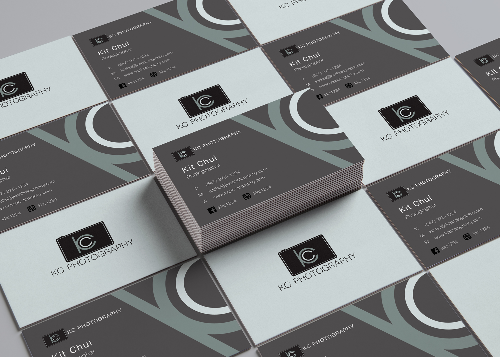
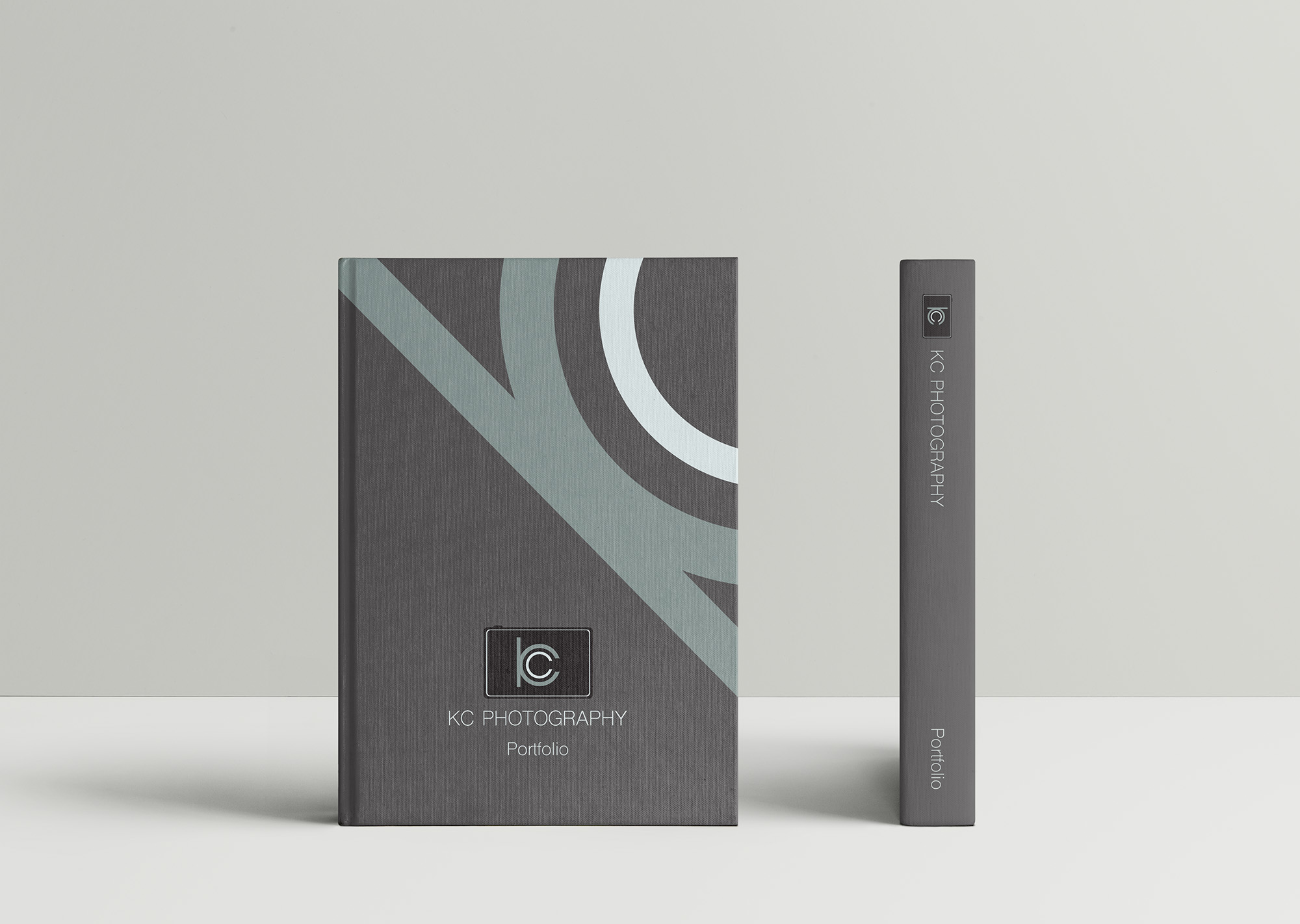
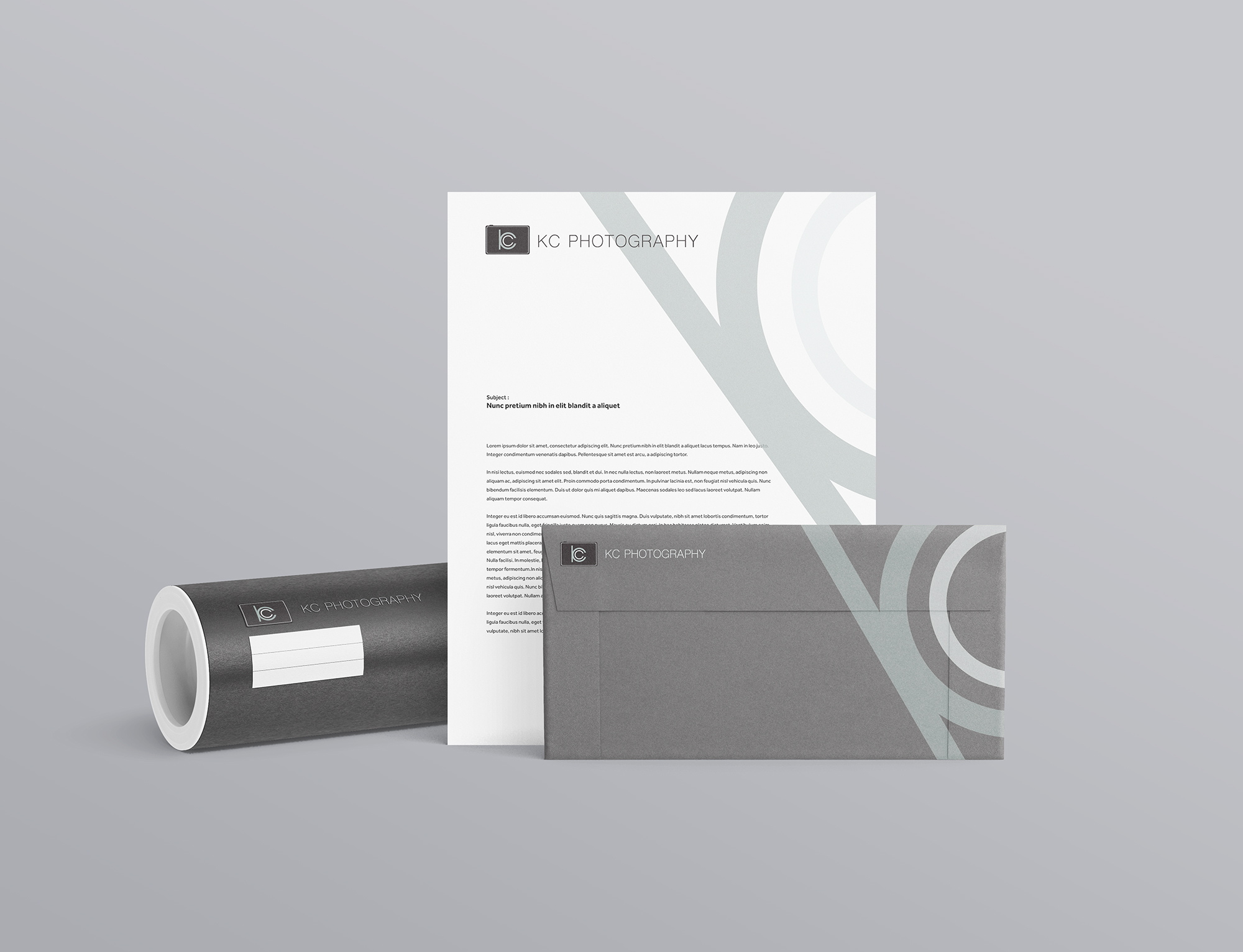
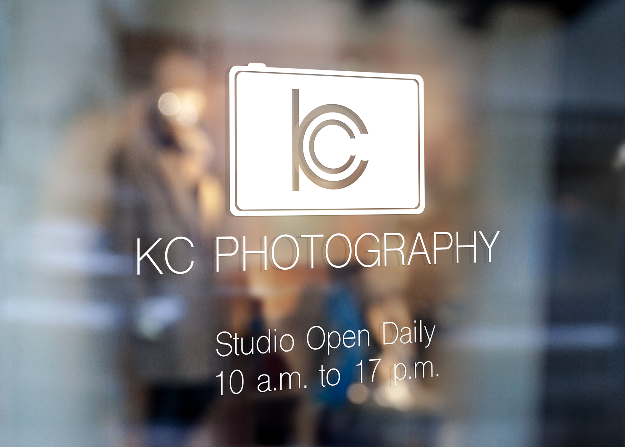
Logo Concept
The logo will creatively merge the letters “K” and “C” into the shape of a camera lens, symbolizing both the company name and its core business. The circular lens structure formed by the letters will visually represent the focus, precision, and creativity of photography. The design will be clean, modern, and minimalist, reflecting professionalism while being versatile enough for different branding materials.
Brand Building Concept
The brand will use a black and grey color palette to reflect professionalism, aligning with the traditional tones of photography equipment. This minimalist color scheme highlights the company’s expertise and precision, creating a sleek, modern aesthetic. With clean typography and a gallery-style presentation of work, the brand image will emphasize high-quality photography services, delivering a cohesive, professional experience across both digital and physical platforms.